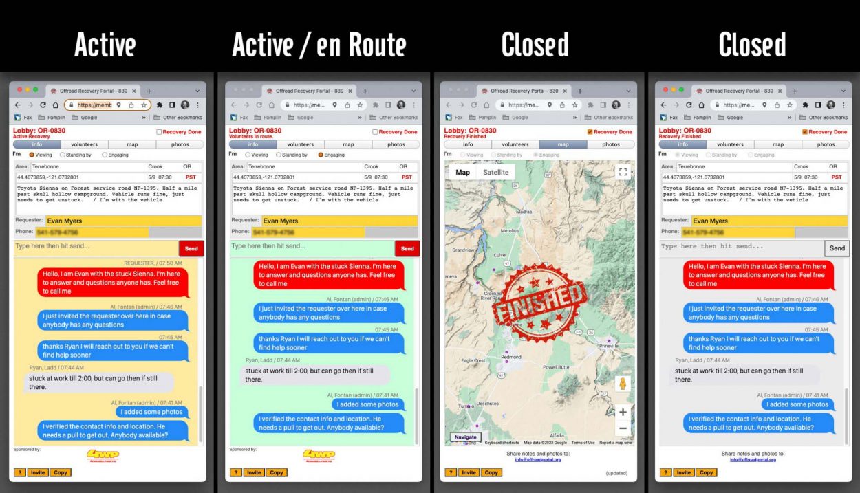
We are thrilled to present a new system feature we have been testing for quite some time. For the past few weeks, some of you might have noticed we upgraded our chat room or lobby. We now present the conversations more familiarly, like a modern text conversation or text message using bubbles.
A typical conversation between you and somebody else would be in two colors, yours is always blue, and the other people in the chat room would be gray.
With our new feature now, we can invite the REQUESTER to the chat room. Their bubbles will always show in red. This way would be easier to scroll thru and identify their messages among volunteers and administrators.
We tested this new feature, which showed great potential to help us coordinate and keep the requester informed of the progress of finding help. It also makes it easier for anybody to ask questions and get answers directly in our system, where everybody gets to share the same.

We also finalized the coloring scheme. When the background is yellow, it means the request is active, and we are looking for volunteers. When it turns green, it means it is active, but we have volunteers en route. And finally, when it is Finished or Closed, and the background is gray, it means it is either a canceled request or a completed recovery.
These subtle changes are slowly starting to improve the usability of our system. We hope you find them useful, and like any time we introduce a new feature, we count on you to let us know if something is not working as intended or if you think you have an idea to improve it.
Thanks to all volunteers out there!

