
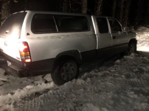
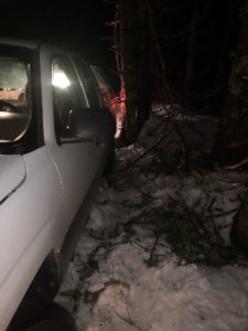
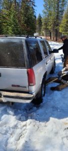
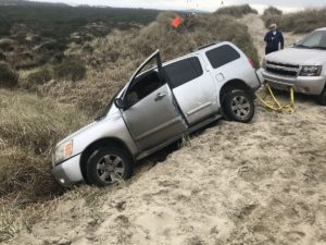
We recently updated our web-app to help us map the location of our members. It is a slow process since we need to wait for each user to log in on the web-app, but while doing this, I thought it was a good idea to map the data we have so far, only about 10%, and contrast these locations with the locations of the recoveries we received in the last few weeks.
Keep in mind this is a partial list, but it makes for some interesting graphical understanding of where the needs are and where the resources are for a better distribution.
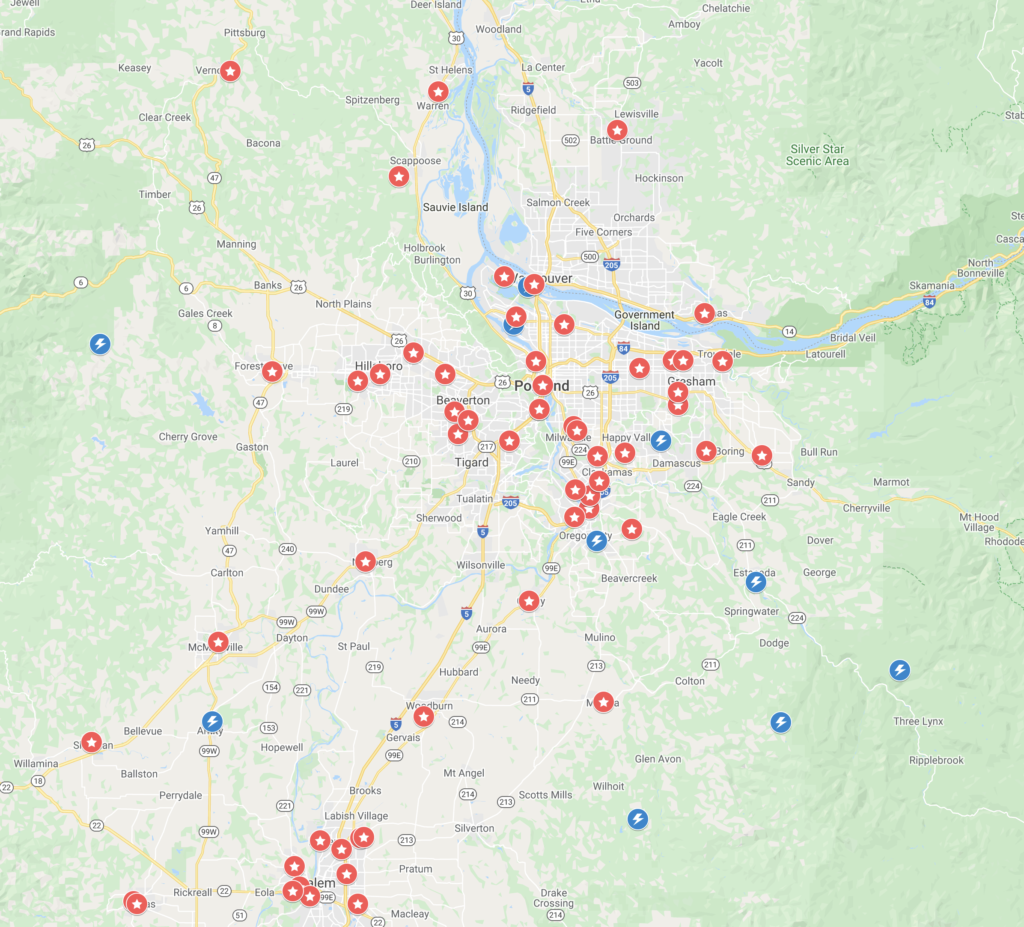
We hope in the future, once we have all our members in our web-app mapped, this will paint a better picture for us when organizing recoveries. This information also shows the value of having a real system to coordinate recoveries compared to just using a Facebook page. The value of seeing these maps when working on recoveries is amazing. Also, in case of a major catastrophe, this geo-information, would allow us to coordinate efforts with other organizations.

What’s coming…
Now we are working on a better way to automate text messaging to members. We are almost ready to roll a new version of our web app that will work perfectly no matter what provider you use. We are using a new system integrated with Twillio, which is not free. So we are trying to use Patrons to help us pay for some of our operational costs, like servers, licenses, and other services. Since Covid-19 started, we shut down our store because mailing was putting too much stress on our team. We hope some of you might see the value on this web-app and might be willing to help us by becoming a Patron.
Hope to see you soon on the trails! Stay safe!